Bloopers: Some of my finest data visualization masterpieces
April Fools version: When some of your data viz bloopers look like modern art and others look like your computer is needs to be exorcised
For both my personal and professional work, I process data, train machine learning models, run experiments, and, quite often, create data visualizations.
I iterate tirelessly to ensure the final data visuzliazion is clear, readable, and tells the right story. However, sometimes I do fail, and the failures are often so ridiculous that I began a collection of my worst and weirdest-looking plots.
In this article, I showcase some of my favorite bloopers for April Fool’s Day. At the end of the article, I explain why data visualizations are so important and some of the more common mistakes I see all of the time.
When the legend doesn’t do its job
Sometimes, red is yellow and blue is green.
A stained glass masterpiece with little informative value
I can’t imagine what information is being conveyed in this plot, but it does remind me a little of stained glass.
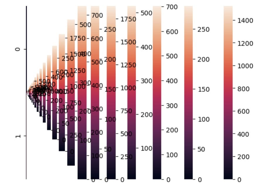
Infinite color scales
You can imagine that the color scale bar goes on into inifinity. I’m pretty sure creating this plot crashed my code. But I do enjoy looking at it.
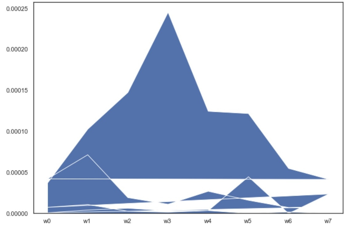
Do you see the mountain ranges?
Sometimes you want to make a line plot and it doesn’t turn out the way you wanted it to.
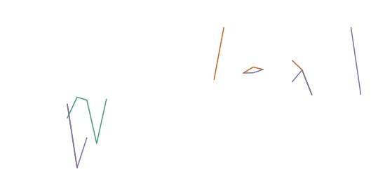
Modern. Exotic. Mysterious.
If you can believe it, this is created using the same data as the previous plot. Again, sometimes you want to make a line plot and it doesn’t turn out the way you want it to.
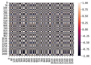
Is that crosshatching I detect?
Unfortunately, I don’t remember where this came from. I have no idea what the color bar on the right side signifies or what it is measuring. Nor do I know why the X-axis increases with a factor of 60 and the Y-axis increases with a factor of 74.
Turning the world on its side
In this plot, I was trying to plot the latitudes and longitudes of all of the geographic locations present in a dataset. However, looks like I flipped the latitudes and longitudes — a rookie mistake, I might add.
When time doesn’t pass the way you expect it to
If you’re plotting something over time, it’s important to have the dates or intervals be consistent and sequential. It is possible that this is true on the X-axis of this plot — you just can’t read any of it.
If everything is important, nothing is important
Here, I was trying to plot how important different features were in a logistic regression. However, by attempting to plot every single feature, it’s impossible to actually tell what is actually important due to all of the visual clutter. In a way, you miss the forest for the trees (and incidentally, the plot does look like a sideways tree).
One of my favorite plots
I think I was trying to create a simple pie chart but this ended up happening. Not gonna lie, I think it’s kinda cool and I would totally print it out and hang it on my wall. It’s giving Museum of Modern Art.
A short plug about data visualizations
In all seriousness, though, data visualizations are a super important part of data science and for all scientific research desiring to visually share findings.
You probably noticed some common patterns across the bad charts … In another article, I’ll explore commonly made data visualization mistakes in more detail. Stay tuned!
If you liked what you read, please leave a comment and subscribe to the publication!
Citation
For attribution in academic contexts or books, please cite this work as
Yennie Jun, "Bloopers: Some of my finest data visualization masterpieces
", Art Fish Intelligence, 2024.
@article{Jun2024bloopersdataviz,
author = {Yennie Jun},
title = {Bloopers: Some of my finest data visualization masterpieces
},
journal = {Art Fish Intelligence},
year = {2024},
howpublished = {\url{https://www.artfish.ai/p/data-visualization-bloopers},
}


