2023 Wrapped: a year of sickness and health
Analyzing my own data to better understand my patterns of wellness
At the beginning of every year, I do a data analysis of the previous year to reflect on everything that happened.
Last year, in 2022, I did an in-depth investigation of my crying patterns.
How I Cried in 2022: An Analysis of 365 Days of Personal Data
I am obsessed with collecting data on myself. Every day of 2022, I filled out a Google Form I made to collect data on myself, tracking items such as whether I cried, exercised, drank coffee, or washed my hair. I also collected data from Apple Health and Google Location History to get a more complete picture of my patterns and behaviors throughout the ye…
This year, for 2023, I analyzed my patterns of sickness and health.
In this article, I show an overview of the data I collected and analyzed about myself in 2023 and some conclusions on how to live a healthier and better life in 2024.
Data Collection Overview
My data come from the following sources:
Google Maps location history
Apple Health
A survey I filled out at the end of every day about daily habits
After combining data from the different data sources, I had a whole bunch of data on myself:
Exercise: step count, average daily heart rate, active calories burned, type of exercise
Geographic location: city, whether I was traveling or not
Diet: eating meat, drinking alcohol, drinking caffeine, eating out
Health: whether I took medicine, what phase of my period
Habits: whether I cried, whether I washed my hair
Wellness cues: whether I had a cold, headache, injury, or was otherwise (physically) well
It was this final variable — wellness cues — that I wanted to learn more about.
I wanted to answer questions like:
How did my exercise patterns vary depending on my health?
Did traveling or being present in certain cities affect my health?
Was I more likely to get sick during different parts of my menstrual cycle?
Did I cry more when not feeling well?
Are there easily preventible things I can do to be as well as possible (e.g. be my best self) in 2024?
Data Exploration
I. Overall wellness statistics
According to my meticulously collected survey data (which I filled out even when I was camping in a thunderstorm with a really bad cold), I was unwell for 161 days, or 44%, of the year. This means that I spent almost half of the year being unwell! ☠️
Breaking down the patterns by month, it’s clear that some months were better than others (e.g. February and August were not great months for me). However, even during the months of relative wellness, I spent a minimum of 20% of my time feeling unwell.
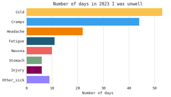
I spent nearly two months out of the year with some sort of cold. However, that wasn’t the only reason that contributed to feeling unwell. I also experienced at least a month and a half’s worth of period cramps throughout the year. 🤮
II. Exercise and movement
How did my exercise patterns vary depending on my health?
(In particular, I distinctly remember the month of August, when I got a mild cold that blossomed into a long-term sickness that wouldn’t go away due to my stubbornness to continue exercising/traveling/going camping/etc).
I calculated a 30-day rolling average to smooth out daily fluctuations and highlight longer-term trends in wellness and exercise habits. The plot shows that, essentially, when I got sick I (mostly) tended to exercise less … but not that much less than normal.
The next plot might be one of my favorite ones. It shows the distribution of my step count and active calories burned (measured via Apple Watch’s ActiveEnergyBurned) based on whether I was well or unwell. Whether I am well or not, my step count does not vary much. However, when I am unwell, I tend to burn fewer active calories. This shows that when feeling unwell, while I moved less intensely, my overall movement did not decrease significantly.
III. Nature, Traveling, and Location
Did traveling or being present in certain cities affect my health?
The heatmap visualizes the prevalence of various unwellness types across different city environments. Darker shades indicate a higher proportion of a specific pain type occurring in a city category, revealing patterns and potential correlations between geographic locations and pain experiences. It shows that while most of my feeling unwell happened at home (which makes sense, as I spent most of my year at home compared to any other location), the second most common place I felt unwell was while traveling.
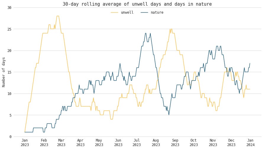
I calculated a 30-day rolling average of unwell days and days spent in nature. The following plot shows an interesting inverse trend. When I’m unwell, I spend little time in nature. In fact, my time spent in nature (which includes time spent in mountains, lakes, oceans, and city parks) seems to be inversely correlated to my wellness. One potential narrative is that feeling unwell makes it less likely that I would spend time in nature (possibly since I may be bedridden).
IV. Women’s Health
Was I more likely to get sick during different parts of my menstrual cycle?
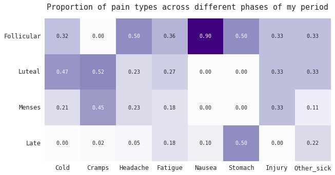
I hypothesized that I was more likely to get sick during my luteal phase (the second half of the menstrual cycle after ovulation and before menstruation) because I vaguely had recollections of that happening throughout the year. And as I will show in the next section … this is indeed a trend that did occur.
Data-driven health outcomes using logistic regression
After getting a sense for the data, I used logistic regression to analyze the data I collected about myself. Logistic regression is a statistical modeling method that can be used to show which factors might be linked to feeling well or unwell. It helps identify which variables or features are statistically associated with the likelihood of wellness.
The model predicts how likely different health outcomes are based on the data I measured. It can be used to spot trends, rather than proving what causes what (e.g. correlation is not equal to causation!).
After running the model, I found out the following:
The top features for predicting “having a cold” were being in the luteal phase of my period and the city of Salvador, Brazil (which makes sense, because I was sick the entire 2 weeks I was in Salvador)
The top features for predicting “having a headache” was taking Ibuprofen (again, correlation is not causation; I most likely took Ibuprofen to alleviate the headache rather than the other way around) and the city of Bellevue, WA
The top features for predicting “having nausea” was taking stomach medicine and antibiotics. For various reasons, I was prescribed antibiotics throughout the year, and it almost always made me feel nauseous
The top features for predicting “period cramps” is (surprise!) being on my period and being in the luteal phase
The top features for predicting “not sick” is not taking medicine (funny; obviously the days I am not sick I will not be taking medicine, so of course those variables are linked) and drinking tea 🫖
Main Takeaways for best health in 2024
The main takeaway for me here is that I need to really be careful to get more rest and take better care of myself — especially during the luteal phase of my period cycle, because that was when I tended to get sick more often.
This is actually backed by science! According to Medical News Today:
During the luteal phase, estrogen levels drop and progesterone levels rise. This allows the body to prepare for the presence of a developing fetus. ... It also means that a person’s immune system function decreases during this phase.
So for all you women reading this blog, take care of yourself during this time! It’s scientifically proven (AND shown in my own data!) that this is more likely to happen. (Note: I am not claiming that the luteal phase of your period will cause having a cold; rather, that the luteal phase makes it more likely to get a cold).
Other takeaways include:
Avoiding antibiotics when possible (which are often overprescribed)
Exercising less while sick
Interestingly, there was little influence of diet (e.g. eating meat or drinking alcohol) in predicting wellness. I always thought eating red meat or drinking alcohol affected my health. However, at least according to the data I collected and analyzed from 2023, their influence was negligible compared to other factors.
What about crying?
Did I cry more when not feeling well?
As a side note (since last year I analyzed my crying habits), what was the interaction between wellness and crying?
In 2023, not much! There seemed to be little correlation between being sick and crying (in both the heatmap below, and in the logistic regression above). I didn’t cry myself sick OR was so sick that I cried. Which seems to be a step up from last year!
Discussion
There is a lot of value in looking at your own data and trying to make sense of it! Google and Apple (and all the other tech companies, large and small) collect so much data about you. Even though the data you are able to download about yourself is large and unwieldy, it is but a drop in the bucket compared to how much data these companies collect about you every moment you even glance at a screen (such as YouTube search history, Netflix recommendations, TikTok engagement, etc.).
Taking agency over your own data by getting your hands dirty, even if all you get out of it is the scale of how much data there is (and how much data is being collected) is extremely important.
And, if you’re a passionate about data like me and want to track daily habits and patterns, you can collect additional data about yourself that no one else has (such as crying, being sick, or dietary habits). Using this data, you can answer basic questions about your health and lifestyle, such as “What factors are more likely to make me sick/anxious/depressed/injured?” or “Is there a correlation between skipping breakfast and getting migraines?”.
What I did NOT do
There’s so much more data I could have included but did not in this article’s analysis, which I would like to look at in the future. I didn’t include sleep data (mostly because I was missing some sleep data from last year) or screen time data. I also did not do any causation statistical tests! What I showed in this article were mostly strong patterns and correlations, not causations.
Conclusion
Diving into my own health and behavioral data is about owning my wellness journey in a way that nobody else can. Despite the growing buzz around AI doctors and AI in healthcare, I believe that no one understands the subtle details of your habits, patterns, and well-being better than you do. For me, it's not just about being informed; it's about becoming an active advocate for my own health and leveraging insights that no AI can fully comprehend.
In this blog, I’ve often explored different ways of understanding the behavior of AI systems. In this article, I take a step back and reflect on how it all fits into our daily lives.
It won’t be long before AI analytical systems will emerge with the ability to take all of your existing messy data sources (think fine-grained geolocation data, health information from wearables, financial information from receipts, social media logs, etc) to generate comprehensive reports about trends and insights in your life.
However, there is great risk with blindly accepting the outputs of such automated systems. I argue that there is profound value in diving into your data yourself. Neither human experts nor “expert AIs” can ever fully grasp the nuances of our stories and realities as we do.
I encourage each of you to dive into your data, explore your patterns, and let your personal insights guide you to a healthier, more aware self.
Art Fish Intelligence is supported by readers like you! If you enjoyed this article, share it with a friend or respond in the comments. Thank you for your readership!
If you're a beginner data scientist or just passionate about data, there's no better starting point than analyzing your own data! If you have a project analyzing your own data, I encourage you to share it in the comments below or with me privately.
Resources
For you data nerds out there, if you want to process your own data, here are the resources I used to process my own data and the survey
Getting address/city/state/country information from lat/lng coordinates from Google location data, using Google Geocoding API
Jotform or Google Forms for collecting daily survey data
Other resources I didn’t necessarily use but could be useful:


